


Household commute times, costs highest in U.S. since 1980
Author: McLaughlin, Ralph
McLaughlin, Ralph. Household Commute Times, Costs Highest in U.S. since 1980. Haus, 27 Mar. 2020, https://haus.com/resources/household-commute-times-costs-highest-in-u-s-since-1980.
1 Household commute times, costs highest in U.S. since 1980
2

4 Published
5 March 27th, 2020
6 A scarcity of homes on the market, lack of construction, and rising home prices may be pushing households to take up residence in suboptimal locales, as the average working American family now spends an hour and twenty minutes and 9.1% of their income on commuting to work—a record share dating back to 1980, when commute times were first captured as part of the US census. What’s more, the rising cost of commuting has been borne disproportionately by homeowners, non-white households, and those that drive to work. Perhaps not surprisingly, these rising costs come at a time when the share of remote workers has also risen to historic highs. Last, residents of our largest metropolitan areas not only incur the highest housing costs, but also the highest opportunity cost of commuting.
7
8 In this Haus special report, we take a deep dive into commuting cost and behaviors using recently released 2018 American Community Survey data. We not only investigate the time and monetary costs of commuting over time, but where—and what types of—American households devote the largest share of their income to their daily slog.
9 By mode: auto commutes lowest since 1980, remote working highest on record
10 While average commute times and costs are up aggregately in the U.S., it surprisingly comes at a time when commuting by automobile is at the lowest rate since 1980, when 85% of commuters drove to work. That share hit a series high of 88.2% in 2003 but has since steadily declined to a near 40-year low of 85.8% in 2018.
11
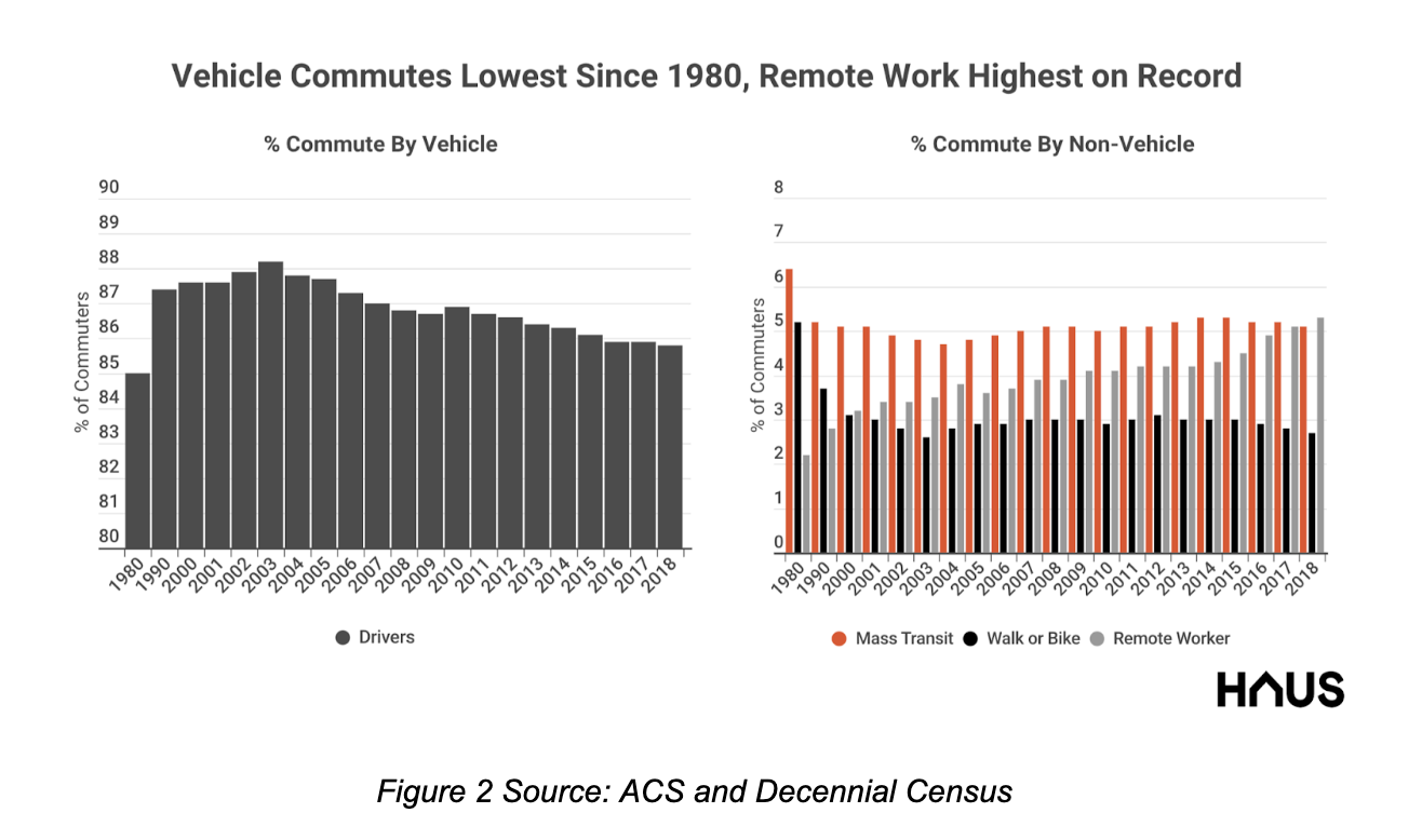
12 If relatively fewer commuters are travelling by car to work, how else are they traveling? The answer is, they’re actually not at all. While one might expect the falling share of auto commuters to be made up by an increase in public transit, pedestrian, or bicycle usage, it’s actually been made up by an increasing share of remote workers. This segment has risen a full three percentage points since 1980, climbing to 5.3% of all workers in 2018 from 2.2% in 1980.
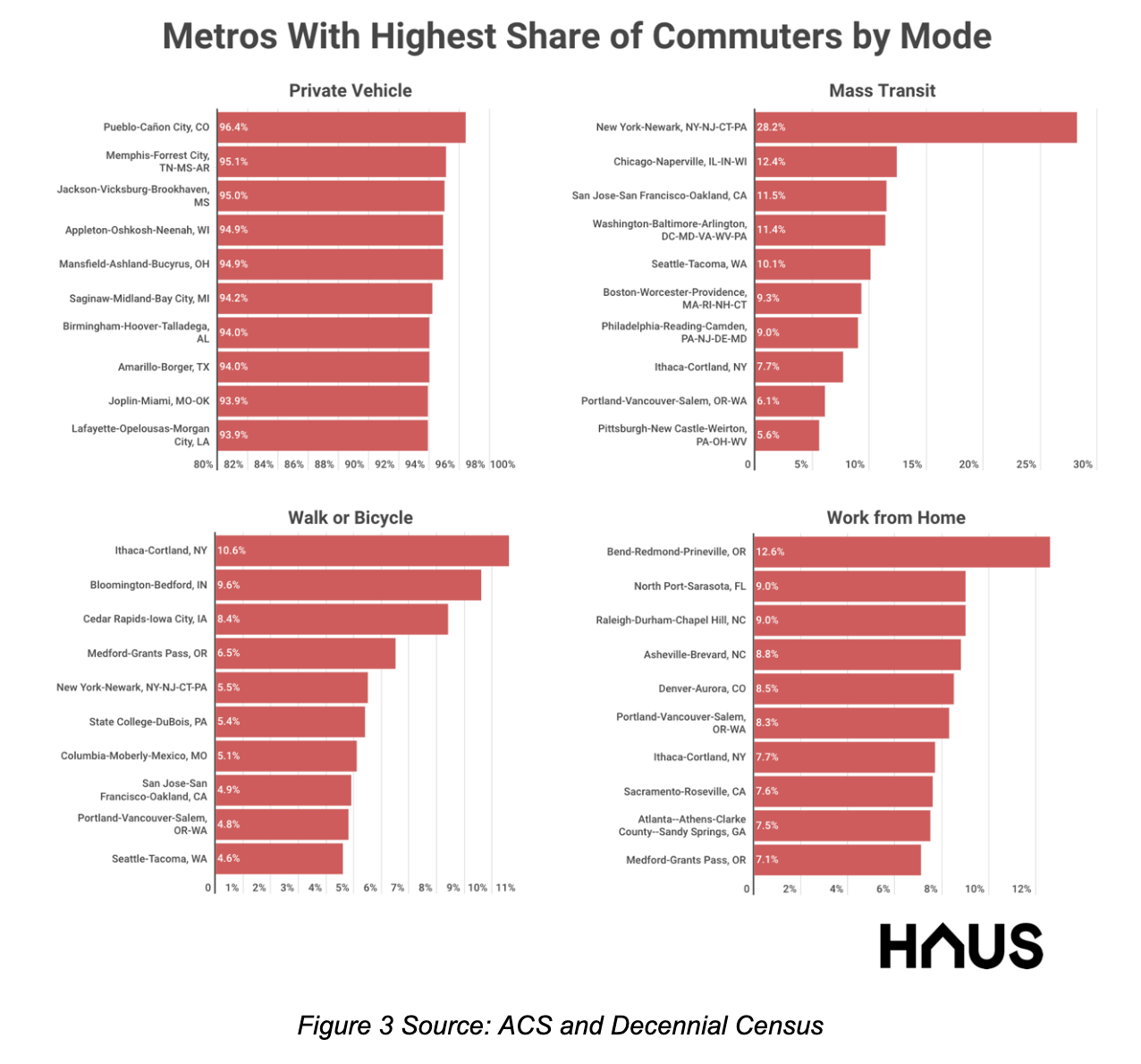
13
14 Commuting method also varies substantially by metro. When it comes to commuting by car, Pueblo, CO, Memphis, TN, and Jackson, MS, top the list, with 96.4%, 95.1%, and 95% of commuters driving to work. Mass transit usage peaks in large markets with well-developed mass transit systems, such as New York, Chicago, and the San Francisco Bay Area with 28.2%, 12.4%, and 11.5% of persons using some type of public transit to get to work. The fittest commuters reside in Ithaca, NY, Bloomington, IN, and Cedar Rapids, IA, where 10.6%, 9.6%, and 8.4% walk or ride a bicycle to their place of employment. When it comes to remote workers, metros with the highest share are in places like Bend, OR, Sarasota, FL, and Raleigh-Durham-Chapel Hill, NC, at 12.9%, 9%, and 9%, respectively.
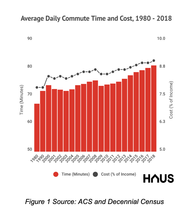
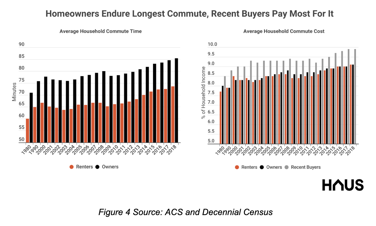
15 Commute times and costs: highest for non-whites and drivers
16 Nationally, the average daily commute of American families has increased by 20.5% over the past 40 years, growing from about 67 minutes in 1980 to over 81 minutes by 2018. As a share of household income, this represents an increase from 7.9% in 1980 to 9.1% in 2018—a high since records began in 1980. While homeowners and renters have seen similar growth rates in their commutes—at 20.5% and 22.5%, respectively—homeowners, on average, endure a daily commute that is 11.8 minutes longer (85.4 vs. 73.6 minutes, respectively). However, the share of household income that homeowners and renters spend on commuting is roughly the same at about 9%. How is it that homeowners endure longer commutes but an equal share of income spent on commuting? Simply put, it’s because homeowners tend to have higher household incomes than renters. Homeowners that bought in just the past year—who no doubt have faced the pressures of low housing inventory and high costs—devote nearly a full percentage point more of their income to commuting at 9.9%.
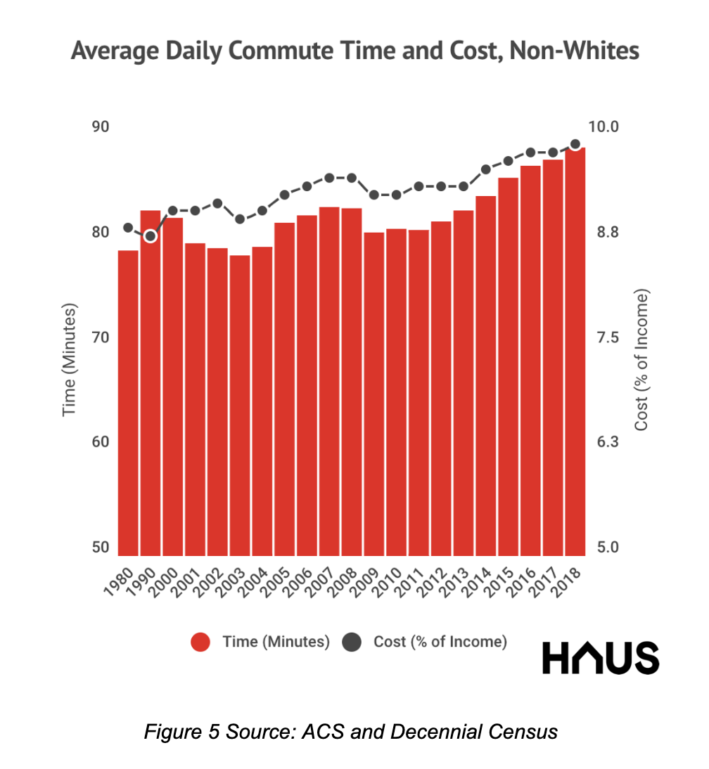
17
18 Rising commute times have also hit other types of households disproportionately. In particular, non-white households and those that drive to work endure significantly longer commutes. For example, the average non-white household commute is over 88 minutes per day—nearly 8 minutes longer than the average American family. However, this was only up 12.4% from 1980 (79 minutes), as non-whites have always historically spent much more time commuting to work than whites over the past 40 years. For non-white households, the share of income devoted to commuting increased a full percentage point from 8.9% in 1980 to 9.9% in 2018.
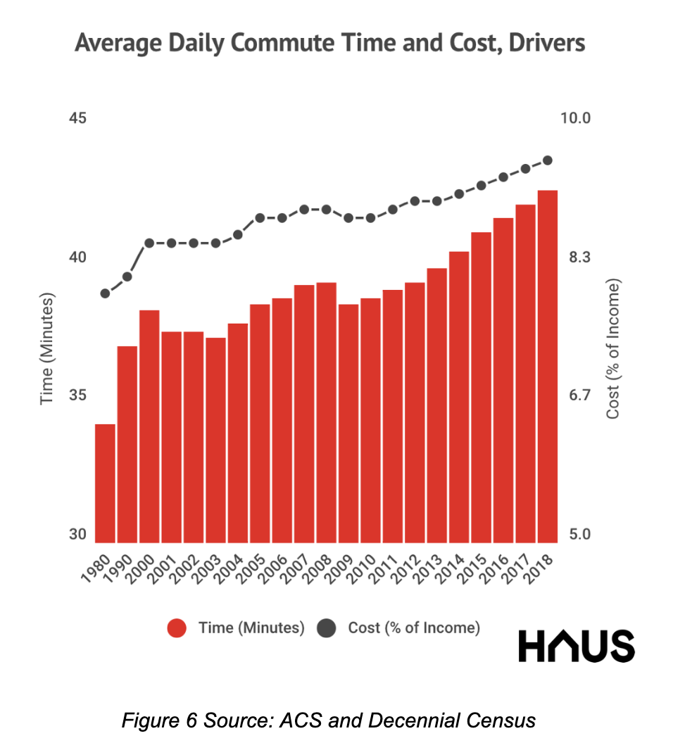
19
20 Commutes of households where the head drives to work have seen considerably longer commutes over the past four decades. Since 1980, household commute times have increased 24.5%, growing from an average of 68.6 minutes to 85.4 minutes per day. This represents a relatively sharper increase in commuting opportunity costs than other cohorts, rising to 11% of household income in 2018 from 9.3% in 1980.
21
22 Want to live in a big city? It’ll cost you in both housing and commuting costs
23 Large metropolitan areas are attractive to workers for various reasons, especially when it comes to labor market mobility (finding a new or different job), cultural amenities, productivity, work experience, and housing choice. While it’s known that because of these factors, large markets tend to have higher prices—in addition to greater housing market competition, higher income levels, and less elastic housing supply—we find the opportunity cost of commuting is also significantly higher in large markets. Why is this? First, as metropolitan areas grow in size, the possible spatial extent of specific workplaces that members of a household might need to commute to increases. For example, imagine a family of four lives in a one-mile diameter circular market where three have to commute to work. The potential area that each of the three would have to cover is 0.79 square miles. Now imagine that market expands, doubling in size to become two miles in diameter. The potential area the three commuters might have to cover doesn’t double in size, but rather it grows at the rate of pi to become one that is 3.14 square miles in size. Thus, as a housing market grows in size, the potential for commute times to increase grows at a faster rate.
24
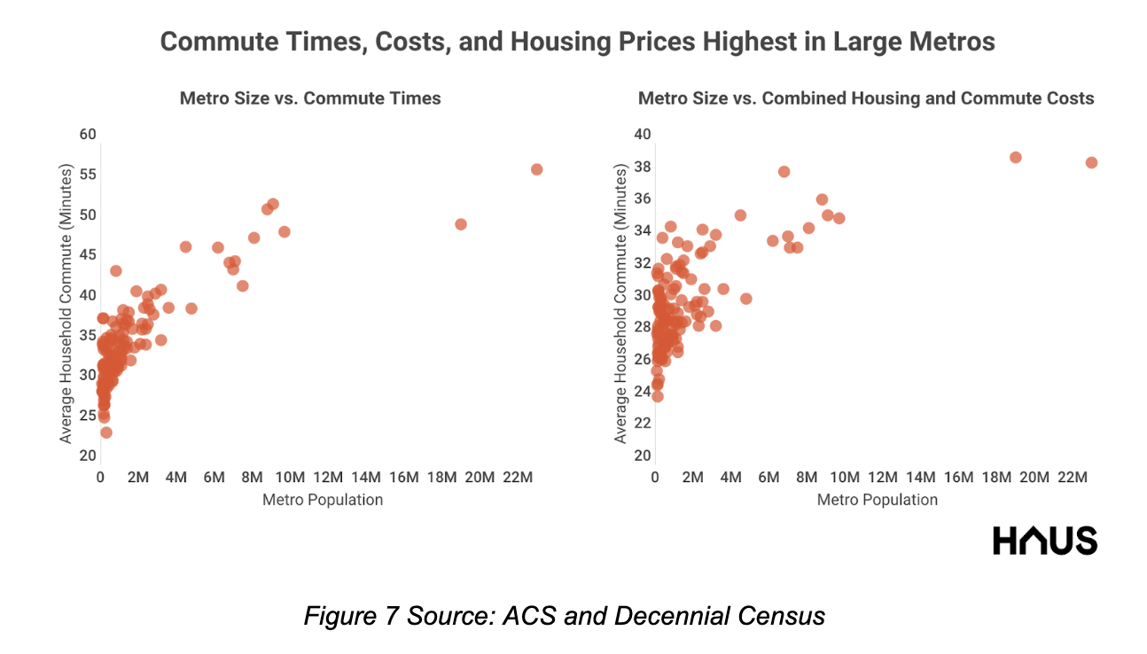
25 In fact, this relationship is demonstrated quite nicely if we look at a scatterplot of U.S. metropolitan population size and average commuting times and costs. As you can see, smaller metropolitan areas—with presumably smaller geographic footprints—have lower average commute times and costs than larger metropolitan areas. As metro population increases, the increase in time and cost is quite steep across markets until you hit the large, densest metros, where the increase in times and cost flatten (likely because of economies of scale with mass transport systems and dense housing close to dense employment).
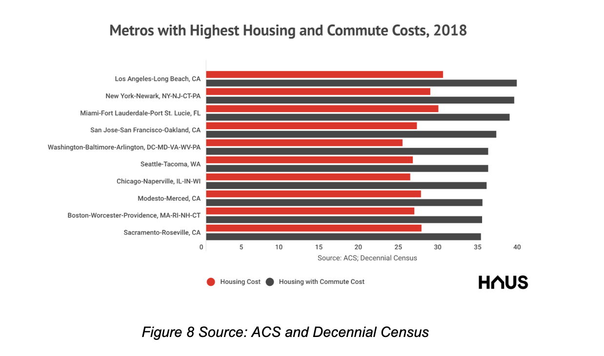
26
27 As demonstrated in the chart above, the biggest housing markets in the U.S., when taking into account commuting costs, also tend to be the largest. Los Angeles edges out its larger counterpart, New York, by just 0.3 percentage points, with the average household shelling out 39.1% and 38.8% of their income to cover their combined housing and commuting costs. Miami, the San Francisco Bay Area, and the greater Washington, D.C. metro area round out the top 5 most expensive with average combined costs of 38.2%, 36.5%, and 35.5%, respectively.
28 The last mile
29 We find that average household commuting time and costs have reached record highs. This comes despite a sharp increase in the share of remote workers over the same time period, while commuters by mass transit, foot or bicycle, and vehicle fell. We also find that commuting costs are higher for homeowners, non-white households, and those that commute by car. Last, our results show that those looking to live in our largest and most productive regional economies will pay a significantly higher share of their income to do so, and not just because of higher housing costs: the cost and time of commuting is also substantially higher.
30 Methodological Notes
31 In this post, we analyze recently released American Community Survey (ACS) data from 2018, along with other ACS and decennial census data made available through IPUMS USA at the University of Minnesota. We use averages for our indicators of time and cost spent commuting instead of medians because at the person and household record level, reported median commute times are almost always also the mode, so values are generally constant over time and provide little insight into temporal variation. Since commute times are top coded, averages are less affected by upper outliers than when using non-top-coded data. We readjust the top coding of commute times to match the lowest top code in the series, which is 99 minutes in 1980. Since some households receive housing assistance, such as vouchers, but aren’t identifiable in the ACS or decennial records, we exclude households where stated monthly mortgage or rental costs exceed monthly household income. In our analysis of racial differences in commuting times and costs, we treat Hispanic whites as non-whites. We calculate commute costs as equivalent to the hourly wage of persons in the workforce who are currently employed, and rolled them up to the household level. We define new homeowners as households who own their home and have moved in the past year. Our metro definitions are 2013 Consolidated Metropolitan Areas (CSAs).
0 General Document comments
2 Sentence and Paragraph comments
3 Image and Video comments
New Conversation
New Conversation
Neighborhoods are not walkable or people reside more and more out of walking distance from jobs. Commuters by vehicle only slightly decrease while remote workers increase at a greater magnitude. Result of an increase in employment (unemployment downward trend)? Vehicles replacing walking/biking?
New Conversation
Hide Full Comment
This shows the uphill nonstop trend of making a place to live in increasingly expensive.
New Conversation
Hide Full Comment
85.4 minutes per day!
New Conversation
Hide Full Comment
General Document Comments 0

